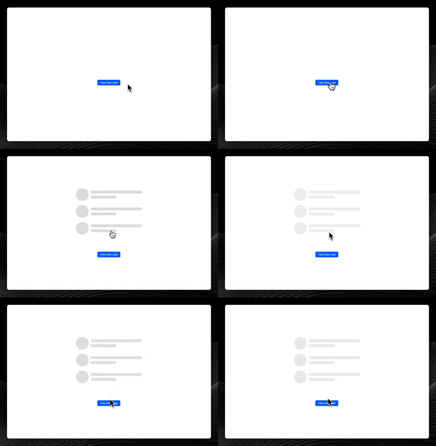
This element is useful as a placeholder when fetching data rather than showing a blank page or spinning wheel. The component is simply a strobing div with controls for height, width, colour & border radius. The simplicity lets you shape & construct skeleton loaders in any shape you can achieve with divs.
Currently there's no way (that I know of) to import custom components from a Github account that isn't yours so in order to use this loader, you'll need to clone/fork this repo to your own Github account, go to your WeWeb dashboard, select the workspace you want to import the component to, select the components tab, click Import Element & then link your newly cloned/forked repo.
To make edits/improvements locally, clone the repo to your machine and follow the instructions below.
Install dependencies with npm install.
To serve locally, run npm run serve --port=[PORT], navigate to the Weweb editor, open the developper popup and add localhost:[PORT] as custom element.
Before release, you can check for build errors by running npm run build --name="ww-button" --type="element"
