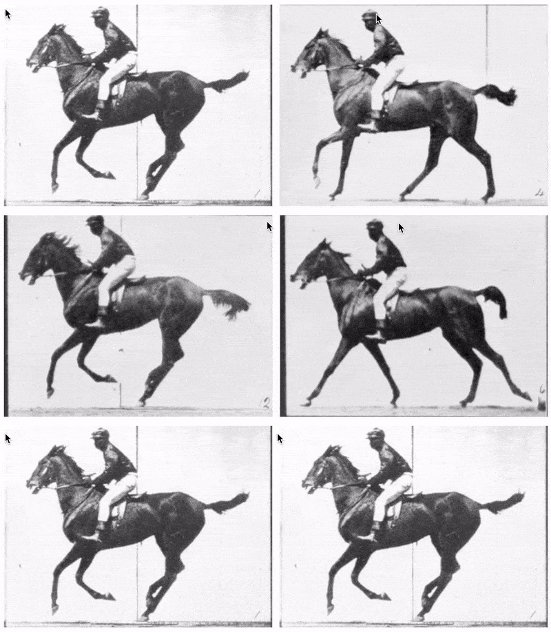
Iterates through an image slideshow based on cursor/touch position.
- Node 10 and higher
- React 16.8 and higher
See the Storybook examples
react-hover-slideshow is distributed via npm which comes with Node. To install it as a dependency of your project, simply navigate to your project directory and run:
npm i --save react-hover-slideshow
This module also depends on your project already having react and prop-types as peer dependencies. If you don't yet have those, you can add them as dependencies of your project with this:
-
npm i --save react prop-types -
⚠️ Warning!⚠️ - this code uses Hooks under the hood, which was introduced in React 16.8. This code will not work with older versions of React.
The simplest way to use react-hover-slideshow is to use the HoverSlideshow component:
import React from "react";
import { HoverSlideshow } from "react-hover-slideshow";

// As a function component
function MyFunctionComponent(props) {
	const imageURLs = [
		"https://example.com/1.jpg",
		"https://example.com/2.jpg",
		"https://example.com/3.jpg"
	];

	return (
		<div>
			<h3>My photo album</h3>
			<HoverSlideshow
				aria-label="My pretty picture slideshow"
				images={imageURLs}
				width="400px"
				height="300px"
			/>
		</div>
	);
}

// Or as a class component
class MyClassComponent extends React.Component {
	render() {
		const imageURLs = [
			"https://example.com/1.jpg",
			"https://example.com/2.jpg",
			"https://example.com/3.jpg"
		];

		return (
			<div>
				<h3>My photo album</h3>
				<HoverSlideshow
					aria-label="My pretty picture slideshow"
					images={imageURLs}
					width="400px"
					height="300px"
				/>
			</div>
		);
	}
}
Alternatively you can use HoverSlideshowAnimated with the same interface, which will give you a nice crossfade effect. Note that this animated variation depends on the peer dependency react-transition-group, which you can add you your project with the following:
npm i --save react-transition-group
Behind the scenes, the helper components above use the hook useHoverSlideshow. If you wish for more control over the image component markup and CSS, I recommend making a copy of /src/HoverSlideshow.js and making this small change:
import React from "react";
import PropTypes from "prop-types";
-import useHoverSlideshow from "./useHoverSlideshow";
+import { useHoverSlideshow } from "react-hover-slideshow";
Then simply use that code as a baseline, and tweak what you like! Here's a quick guide of what's happening in the hook:
-
currentImage- determined by figuring out the user's "cursor progress" over an element, then finding the closest match in theimagesarray passed in. For instance, ifimagescontains two image hrefs, the first image will display until the user's cursor passes over 50% of the element (where 50% is defined horizontally by default). -
updateHoverSlideshow- updatescurrentImagebased onmousemoveandtouchmoveevents -
resetHoverSlideshow- should be called when the user is no longer interacting with the element (mouseoutortouchend). Resets by displaying the first image in the array.
- Clone this repo:
git clone [email protected]:davidcalhoun/react-hover-slideshow.git - Navigate to directory:
cd react-hover-slideshow - Install dev dependencies:
npm i - Check the
scriptssection inpackage.jsonfor a list of available dev commands.

